The Designer-Less Design Workflow: Stitch MCP and the Death of Figma Handoffs
269 AI-generated screens, zero Figma files, and the branding bug that taught me to treat prompts as build artifacts
View companion repoScreen 22 is where I noticed it. The header said “Awesome Video Dashboard.” Not “Awesome Lists.” I scrolled back through eight screens, 15 through 22, and every one of them said “Awesome Video Dashboard.” My prompt said “Awesome Lists” every single time. The AI just… drifted.
That branding bug cost me an hour of rework. It also changed how I think about every design prompt I’ve written since.
Why I Ditched Figma
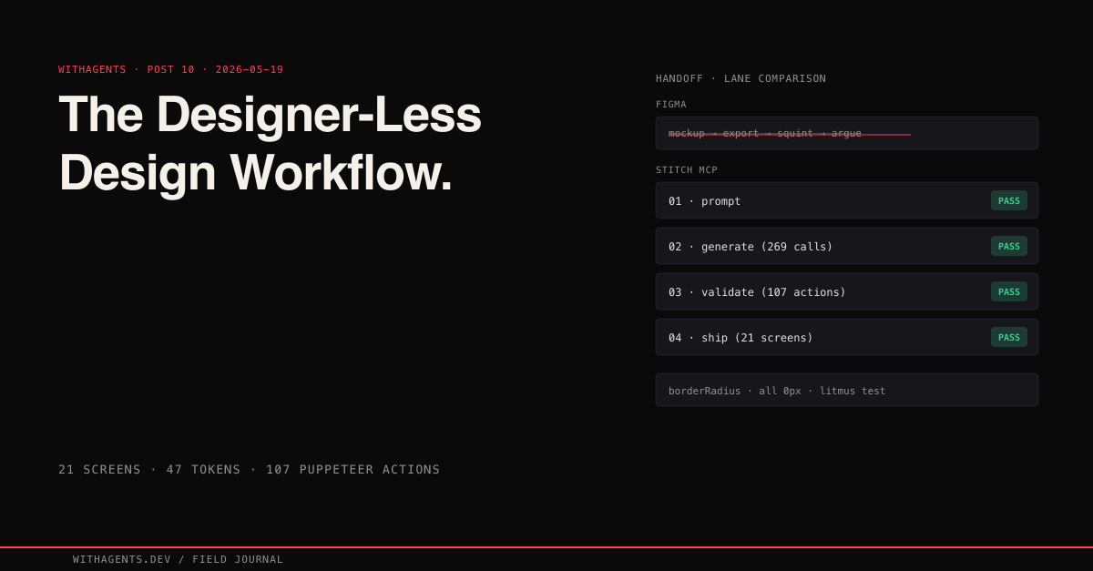
You know designer-to-developer handoff? It’s a game of telephone. Designer makes a mockup. Exports a spec. Developer squints at it. They argue about whether the padding is 16px or 20px. Designer updates the mockup. Developer updates the code. Three days go by. The button is still wrong.
I had a different problem: no designer. I was building an iOS app, a web dashboard, and a blog series site across 23,479 sessions in 42 days. That’s not a pace where you can hire someone to make Figma comps. And learning Figma well enough to produce professional-grade mockups? I couldn’t justify the time.
Google’s Stitch MCP changed the game for me. Instead of designing in a visual tool and exporting specs, I described what I wanted in plain English and got rendered screens back. Not wireframes. Rendered HTML with real components, real colors, real typography. The gap between “design” and “code” collapsed to a single conversion step.
Across all projects: 269 generate_screen_from_text calls and 87 list_screens calls. That’s 21 unique screens across 269 total Stitch generations — multiple iteration rounds per screen, A/B/C variants, and regenerations after the branding bug. Every one described in English, generated by AI, converted to production code. I never opened a design tool. Not once.
The Stitch Loop
Three phases, tight cycle: prompt, generate, validate. A single screen goes from English description to rendered React component in under 15 minutes.
Every prompt follows the same four-part structure:
- 01Device type — mobile, desktop, or tablet
- 02Design system tokens — every color, every spacing value, every typography spec, verbatim
- 03Component primitives — the base components and their variants
- 04Screen description — what this specific screen shows, with layout details
“Verbatim” is the load-bearing word. Not “use the same colors as before.” Not “see previous specs.” The full token set, pasted into every single call. I learned this the hard way.
The Branding Bug That Changed Everything
By the 15th generate_screen_from_text call, Stitch started producing “Awesome Video Dashboard” instead of “Awesome Lists.” My prompt clearly said “Awesome Lists.” The generated screen said “Awesome Video Dashboard.” Eight screens had the wrong name before I caught it at screen 22 during a visual review.
Why did this happen? Each Stitch MCP call is stateless. The model doesn’t remember previous calls. By call 15, my prompt’s design system description was competing with the model’s training data about what “awesome” dashboards look like. “Awesome Video Dashboard” is a more common pattern in training data than “Awesome Lists.” So the model defaulted to what felt familiar.
The fix was three lines of bash:
That found all 8 contaminated screens. But the deeper fix was a workflow rule I now treat as non-negotiable: the full design system, including the exact product name, goes in every prompt, every time. Not “see previous specs.” Not “continue the design from screen 14.” Verbatim. The entire token set, the exact product name, the component primitives, pasted into every generation call.
This wasn’t a Stitch defect. It was my fault. I assumed the AI would maintain context across calls, like a human collaborator would. It can’t. It won’t. And the moment you accept that, you build systems that don’t depend on it.
I documented the full failure mode and prevention strategy in docs/branding-checklist.md in the companion repo. The key insight: treat the product name as a design token, not as free text. Add "brandName": "Awesome Lists" to your token file and interpolate it into every prompt programmatically.
The Design Token Pipeline
The token file is the single source of truth. Everything else (Tailwind utilities, React component styles, Stitch prompts) is a generated artifact. Change one value in tokens.json and it propagates everywhere.
47 tokens across 7 categories: 18 colors (including glows and subtle variants), 8 typography sizes, 5 font weights, 5 line heights, 15 spacing values, 8 border radii (all set to 0px, more on that in a second), and 8 shadow definitions. Here’s a slice:
Every border radius is 0px. Every. Single. One. This is the most distinctive design decision in the system and it serves a specific engineering purpose: it’s an instant visual litmus test. If any component renders with rounded corners, the token pipeline is broken. You can spot the failure from across the room.
The tailwind-preset.js file reads tokens.json and maps every value to Tailwind utilities:
See that fontFamily.sans pointing to JetBrains Mono? A monospaced font as the sans-serif default. Intentional. It means every Tailwind utility that uses font-sans gets the brutalist monospace treatment without any component needing special handling.
The result: a developer writes bg-background text-primary font-mono and gets the exact design system colors without ever typing a hex code. Change #e050b0 to #00ff88 in tokens.json and every component switches from hot pink to neon green. One file change, 21 screens updated, zero manual edits.
Prompt Engineering for Visual AI
Writing prompts for Stitch is nothing like writing prompts for text generation. With text, you can be conversational. With visual generation, precision is everything. “Make it look dark and modern” produces garbage. Exact hex values produce consistency.
Here’s the structure that worked across 269 generation calls:
A few lessons from iterating on this:
Describe, don’t request. “Make a login page” produces something generic. “A login page with a centered card (max-w-md) on a pure black background, the card uses #111111 background with a 1px #2a2a2a border, contains: email input, password input with show/hide toggle, ‘Sign In’ CTA button in hot pink (#e050b0), ‘Forgot Password’ link in cyan (#4dacde)” produces something specific and consistent.
Hex values are non-negotiable. “Dark gray” means different things to different models. #111111 means exactly one thing. Every color in every prompt is a hex value. No exceptions.
Specify interactive states or the AI will invent them. And the ones it invents won’t match your system. “Button hover: background shifts to #c040a0, box-shadow: 0 0 20px rgba(224,80,176,0.4)” saves you from fixing inconsistent hover effects later.
Session length kills quality. Generating 21 screens in a single long session caused the later screens to degrade. The sweet spot was 5-7 screens per session. I grouped them by logical flow (public screens, auth screens, user screens, admin, legal) and started fresh for each group.
The A/B/C Variation Strategy
For high-traffic screens (Home, Resources, Login), I generated three variations:
- 01Variation A: Conservative. Established patterns, maximum usability.
- 02Variation B: Bold. Larger typography, more whitespace, dramatic accents.
- 03Variation C: Experimental. Unconventional structure, maximum visual impact.
The prompt appendix looked like this:
All three variations went through the Puppeteer validation suite. I picked winners based on visual consistency, interaction clarity, and information hierarchy. Variation B won for the Home screen. Variation A won for everything else. The experimental layouts looked interesting but created usability problems I didn’t want to solve.
The generate_variants MCP call (20 total calls across all projects) let me explore design space differently. Take an existing screen and produce variations instead of generating from scratch. More useful for refinement than initial exploration.
Validation: Proving Tokens Actually Propagate
A screenshot proves the UI rendered. It doesn’t prove the right colors are applied, the right fonts loaded, or the right spacing was used. Ever stared at two slightly different grays and wondered which one matched your spec? That’s why the Puppeteer validation suite runs 107 actions across all 21 screens, and the most important actions are the programmatic ones:
Not “dark enough.” Not “looks like the right gray.” Computationally verified to be exactly rgb(17, 17, 17).
The validation runs in layers:
- 01Render checks — does the page load without errors? (HTTP 200)
- 02Element presence — are key UI elements visible? (data-testid selectors)
- 03Interaction checks — do clicks, fills, and navigations work?
- 04Screenshot captures — visual evidence for human review
The Admin Dashboard alone accounts for 25 of the 107 checks, one per tab (it has 20 tabs) plus KPI card validation. Why so dense? Because the more complex the screen, the more the AI-to-code conversion introduces subtle errors.
Here’s the experiment that proved the pipeline works: I swapped the primary color to hot pink across the entire token file. 21 screens turned pink. But 2 components had hardcoded hex values that didn’t change. The swap exposed token leaks, places where an agent had typed a hex code directly instead of referencing the token. I fixed those 2 references and ran a grep to make sure no other hardcoded colors existed:
Any match outside config files is a token leak. Zero matches means the pipeline is clean.
The Baton System for Batch Generation
To handle volume, I built a 206-line Stitch-loop skill with a baton system. The pattern is simple: read next-prompt.md, consult SITE.md and DESIGN.md for full design context, generate via Stitch, retrieve the HTML, integrate into the site, update the sitemap, then write the next baton for the following screen.
Why batons? Each generation is self-contained. The skill reads what to generate, produces it, and writes instructions for what comes next. No shared state, no orchestrator tracking 20 parallel screens, no risk of one generation’s failure cascading to the others.
Batch generation ran 8-10 hero images at a time across parallel agents. One call: “Generate 10 Stitch hero images for blog posts 12-21.” Another: “Generate 8 Stitch hero images for blog posts 22-29.” The baton system made sure each agent had the full design context without depending on any other agent’s output.
This mattered because of that statelessness lesson from the branding bug. Each baton file contained the complete design system spec, not a reference to it. The batons were bigger than they needed to be, repeating the same 20 lines of token definitions in every file, but they were immune to context drift. Redundancy is cheaper than debugging 8 screens with the wrong product name. I’d already learned that the hard way.
What I Should’ve Done Differently
Started with W3C Design Token Community Group (DTCG) format. My custom JSON schema worked fine, but every design tool that supports token import expects DTCG. If I ever want to import these tokens into Figma (ironic, I know), or share them with a design team, or use Style Dictionary, I’d need to rewrite the format. Starting with DTCG would’ve cost nothing and preserved interoperability. I’m honestly not sure why I didn’t just do this from day one.
Built the branding check into the prompt builder from the start. I documented the branding bug and wrote a prevention checklist after the fact. But the real fix was a buildPrompt() function that interpolates tokens.brand.name from the token file into every prompt automatically:
This eliminates branding drift by construction. The product name comes from the token file, not from my memory.
Validated font loading explicitly. JetBrains Mono doesn’t load in headless Puppeteer by default. My validation suite checked structure and color tokens but didn’t verify font rendering until I switched to non-headless mode. That should’ve been in the suite from the start.
The Bigger Idea: Prompts as Build Artifacts
Here’s what’s weird about this whole workflow. The single-source constraint that makes Figma-to-code handoffs tedious is exactly what makes AI-to-code handoffs reliable. A human designer holds the design system in their head, notices when a component deviates, fixes it intuitively. An AI can’t do any of that. It needs the exact tokens in the exact prompt on every call.
That realization shifted how I think about prompts. They’re not instructions. They’re build artifacts. When the tokens change, the prompt changes. When the prompt changes, the follow-up generation call produces screens that reflect the new tokens. The prompt is part of the build pipeline, no different from a Tailwind config or a webpack rule.
The Stitch prompt block in my DESIGN.md (Section 6) is the canonical example:
“Use a dark theme with background color #0f172a. Use #1e293b for cards and elevated surfaces. Primary accent is #6366f1 (indigo/purple). Use #22d3ee (cyan) for metrics and data highlights. Text colors: #f1f5f9 for headings, #cbd5e1 for body, #94a3b8 for subtle text. Use system-ui font stack. Rounded corners (8-12px). No heavy shadows — use color contrast for depth.”
That block appears in every Stitch generation call for the blog series site. It’s not documentation. It’s not a style guide for humans. It’s a machine-readable specification that produces consistent output when fed to the generation model. The moment I started treating it that way (version-controlling it, reviewing changes to it, testing that changes propagated correctly) the design consistency problems vanished.
The Numbers
Across 23,479 total sessions and 42 days of development:
- 01269 generate_screen_from_text calls
- 0287 list_screens calls
- 0320 generate_variants explorations
- 0447 design tokens in the single source-of-truth file
- 055 base shadcn/ui components (Button, Card, Input, Tabs, Badge)
- 0621 production screens for the Awesome Lists project
- 07107 Puppeteer validation actions across those 21 screens
- 080 Figma files opened
- 090 lines of CSS written by hand
- 108 screens contaminated by the branding bug (all fixed in under an hour)
This blog, the site you’re reading right now, uses the same Stitch workflow. The Midnight Observatory design system (Stitch project ID 5577890677756270199) generates hero images and social cards for all 33 posts. Every hero image is a generate_screen_from_text call with the Section 6 prompt block from DESIGN.md embedded verbatim. The design system vocabulary (Void Navy, Slate Abyss, Indigo Pulse, Cyan Signal) became a shared language precise enough to survive hundreds of generation calls without ambiguity.
Try It
The companion repo at github.com/krzemienski/stitch-design-to-code contains the full workflow:
- 01design-system/tokens.json — the 47-token source of truth
- 02design-system/tailwind-preset.js — token-to-Tailwind mapping
- 03prompts/ — structured prompt templates for all 21 screens
- 04components/ui/ — the 5 base shadcn/ui primitives with CVA variants
- 05validation/ — the 107-action Puppeteer validation suite
- 06docs/branding-checklist.md — the branding bug case study and prevention
Clone it, swap in your own design tokens, and run generate_screen_from_text with your own design system. The token pipeline, prompt templates, and validation suite are all designed to be forked and adapted.
Is this workflow flawless? No. The branding bug cost me an hour of rework. Font loading in headless browsers is still annoying. The A/B/C variation strategy produces more output than you actually need. But compared to the traditional two-week Figma-to-developer handoff cycle, describing screens in English and getting rendered components back in minutes is a fundamentally different speed. The flaws are worth fixing because the alternative is slower by an order of magnitude.
Design tools aren’t going away. The handoff is. The gap between “what it should look like” and “what the code produces” used to be filled by screenshots, Zeplin exports, and meetings. Now it’s a JSON file and a structured prompt. The token file is the design. The prompt is the spec. The validation suite is the acceptance test. Everything else is generated.
Continue the series
- 11Memory & HooksSpec-Driven Development: Why YAML Beats Verbal Instructions for AI AgentsA single YAML file replaces meetings, tickets, and Slack threads — agents read it, build in parallel, and ship without asking clarifying questions
- 12Memory & HooksTeaching AI to Remember: Cross-Session MemoryA SQLite observation store and MCP memory server that turns 23,479 sessions of amnesia into searchable institutional knowledge
- 13Memory & Hooks84 Thinking Steps to Find a One-Line BugHow structured hypothesis-test-revise chains solve bugs that brute force debugging never will
- 14Memory & Hooks35 Worktrees, 12 Agents, Zero Merge ConflictsParallelism gets agents working at the same time. Choreography is what keeps their work from eating itself alive when they finish.